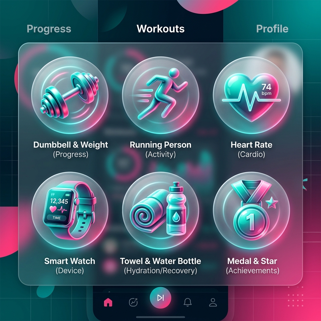
How to Create Consistent Icon Sets (Why Your App Feels "Off" Without One)
Mixing icon styles makes users intuitively distrust your application, even when they can't say why. Here are the seven properties that make a set feel like a family, and how to enforce them.
Icora Team
Design

Have you ever walked into a room where one chair is a Victorian antique, another is IKEA modern, and a third is a plastic lawn chair? It feels chaotic. It feels temporary. It makes you wonder whether anyone was in charge.
We do this to our interfaces all the time. A "Settings" gear from Material Design. A "User" profile from Font Awesome. A custom logo mark drawn in-house. Each one is fine on its own; together they read as unfinished. To the designer they might look "close enough." Users notice — even when they can't say what they noticed.

The Subconscious Trust
People are excellent pattern matchers. Even non-designers register when the stroke weight changes from 1.5px to 2px between two icons, or when one icon has rounded corners and its neighbor has sharp ones. They may not articulate it, but they feel it — and that feeling shades into "this product is rough around the edges."
The 7 Pillars of Consistency
Consistency comes from rules, not taste. This is the checklist we use when auditing a set:
- Stroke Weight: Must be identical (e.g., exactly 2px at 24px size).
- Corner Radius: Consistent rounding (e.g., 2px radius on all external corners).
- Perspective: 2D flat vs isometric. Never mix them.
- Terminal Shape: Butt cap vs round cap stroke endings.
- Level of Detail: Simple outline vs complex illustration.
- Fill State: All outline or all solid. Mixing should indicate state (active/inactive), not style.
- Optical Volume: Do they "feel" the same size?
The Art of Optical Correction
Here is the counterintuitive part: mathematically equal sizes look unequal. Draw a 20px square next to a 20px circle and the circle looks smaller, because it covers less area — the corners are missing. To make shapes look equal, you have to break the grid deliberately.
Rules of Thumb:
- Square: 20x20px
- Circle: 22x22px (overshoot)
- Triangle: 22x20px (overshoot vertically)
- Rectangle: 24x16px (wider to compensate for height)
Pro Tip
Trust your eye, not the numbers. If it looks wrong, it is wrong, even if the math says it matches.
AI as the Great Equalizer
This is where AI genuinely changes the workflow. Extending a set used to mean hiring the original illustrator or painstakingly reverse-engineering their decisions. Now you can feed an "anchor icon" into a model and ask for a magnifying glass in exactly that style. The process that works:
Create Anchor Icons
Generate 3-5 icons that define your style. These become the reference for everything else.
Analyze Characteristics
Document the stroke weight, corner radius, detail level, and perspective of your anchors.
Refine Your Prompt
Write a detailed style prompt incorporating your analysis. Be specific about weight, corners, and style.
Batch Generate
Use the refined prompt to generate remaining icons. Workspace mode maintains consistency.
Manual Refinement
Edit outliers in Studio. Adjust any icons that don't match the set characteristics.
Export Together
Export all icons with identical settings to ensure consistent optimization.
| Style | Stroke Weight | Best For | Example Sets |
|---|---|---|---|
| Light | 1-1.5px | Modern, airy interfaces | Feather, Phosphor Light |
| Regular | 1.5-2px | Most applications | Lucide, Heroicons |
| Medium | 2-2.5px | High contrast needs | Font Awesome, Tabler |
| Bold | 2.5-3px | Emphasis, navigation | Phosphor Bold, custom |
Frequently Asked Questions
What makes an icon set look consistent?
Seven shared properties: stroke weight, corner radius, perspective, terminal shape, level of detail, fill policy, and optical volume. Lock those rules down and icons of completely different subjects still read as one family.
What stroke weight should my icons use?
Pick one weight and apply it everywhere — 1.5-2px at a 24px grid is the most common range for interfaces. Lighter reads airy but gets fragile at small sizes; heavier reads bold but clogs fine detail.
Why do my icons look different sizes when the pixels match?
Optical volume. A circle covers less area than a square with the same bounding box, so it looks smaller. Compensate by overshooting round and pointed shapes slightly beyond the grid until they feel equal.
Can AI keep a whole icon set consistent?
Yes, if you anchor it: generate a few reference icons that define the style, document their rules, and generate the rest against that reference — then manually correct the outliers. Consistency comes from the rules, not the model.
Found this helpful? Share it!
Ready to Create Stunning Icons?
Put these principles into practice with Icora's AI-powered icon generator, professional studio tools, and developer-ready export.
Start Creating Free