The Silent Tongue: Why Icons Speak Louder Than Words
Exploring "Beeldtaal" — the Dutch concept of image language. What the research actually says about how fast we process visuals, and how to use it for better UX.
Icora Team
Design Theory

There is a useful concept in Dutch design culture called "Beeldtaal" — literally, "image language." It captures a simple but radical idea: images are not decorative supplements to text. They are a distinct, autonomous form of communication with their own grammar, syntax, and vocabulary.
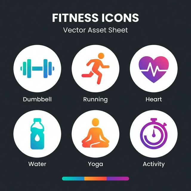
In the digital realm, icons are the words of this language. When we design an interface, we are writing a sentence in Beeldtaal. If your icons are unclear or inconsistent, you are not just making "bad art" — you are speaking gibberish to your user.
The Speed of Sight
You may have seen the claim that we process visuals "60,000 times faster than text." It is worth knowing that this number has never been traced to an actual study — it appears to originate from a 1980s marketing brochure and has been repeated ever since. The real research is less catchy but still remarkable.
A 2014 MIT study (Potter et al.) found that people can identify the gist of an image shown for as little as 13 milliseconds. The well-documented "picture superiority effect" shows that concepts presented as images are recognized and recalled more reliably than the same concepts as words. And unlike reading — a learned skill that decodes abstract symbols into sounds into meaning — basic visual recognition is something our brains do natively.

This is why scanning a dashboard works at all. Users don't read "Settings" — they recognize the gear silhouette. They don't read "Home" — they perceive the house shape. That rapid pattern matching is a large part of what makes an interface feel "intuitive."
This ease of processing is fragile. If your "Settings" icon looks like a flower, the user's brain stumbles — it has to fall back from fast visual recognition to slow deliberate interpretation. Designers call the result cognitive friction.
Try Icora FreeUniversality: The Barrier Breaker
Text is bound by linguistic borders. "Home" is "huis" in Dutch, "maison" in French, "家" in Japanese, "بيت" in Arabic. Reaching a global audience with text means localization for every market.
But a simple geometric outline of a shelter is understood in Tokyo, New York, and Amsterdam instantly. Visual language is the closest thing humanity has to a universal tongue — with the caveat that some metaphors are culturally specific, which is exactly why established conventions matter so much.
Lessons from the Road
The most successful example of Beeldtaal is not on the web but on the highway. A stop sign is an octagon (shape) and red (color) — you don't need to read the word to know what to do. The hazard symbol, black on yellow, triggers caution before you have identified the threat. Road signage works at 100km/h precisely because it relies on shape and color before language. Interfaces deserve the same primal clarity.
The Vocabulary of UI
Like any language, Beeldtaal evolves. Fifteen years ago, three horizontal lines meant nothing; today the "hamburger menu" is a near-universal signifier for navigation. New words do enter the lexicon — but slowly, and through mass repetition.
Which is why designers should be conservative about inventing vocabulary. It may be tempting to design a clever new abstract shape for "Search," but the magnifying glass is simply better communication. In Beeldtaal, clarity always trumps novelty.
Found this helpful? Share it!
Ready to Create Stunning Icons?
Put these principles into practice with Icora's AI-powered icon generator, professional studio tools, and developer-ready export.
Start Creating Free