Halftone IconsGenerate a matching set with AI
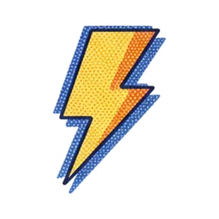
Halftone icons shade with dots: the printing technique that built comics and newspapers, where tone comes from dot size and spacing rather than continuous gradients. Zoom in and the image dissolves into pattern; zoom out and it snaps into form.
When to use halftone icons
Halftone flavors editorial design, zines, band merch, skate graphics, and anything wanting analog print grit. It converts flat shapes into textured ones without adding color — useful for one and two-ink print jobs where gradients are impossible but dots are free. Keep dot scale consistent relative to icon size across the set, or icons appear printed at different resolutions.
Best for
- Zines and editorial
- Band and tour merch
- Skate and streetwear graphics
- Risograph and screen print projects
- Comic-adjacent branding
Example prompts
Paste one of these into the generator, or describe your own theme — every icon in the batch comes out in the same halftone style.
Frequently asked questions
Where should halftone dots go in an icon?+
Where tone lives: shadow sides, rounded surfaces, background fades. Keep at least one area solid and one area pure paper so the dots read as shading, not as an all-over pattern. Fading dot gradients toward highlights sells the print effect.
Are halftone icons good for screen printing?+
Excellent — halftone was invented for exactly this constraint. Each color layer stays a single ink, with dots simulating tone. Export high-res PNG for separations, and keep dot pitch coarse enough for your mesh count.
Related styles



Keep reading
Make your halftone icon set
Describe a theme, pick the Halftone preset, and get a consistent set of up to 50 icons — exported as high-resolution PNG up to 4K. Free to start, no credit card required.
Start generating — it's free