Claymorphism IconsGenerate a matching set with AI
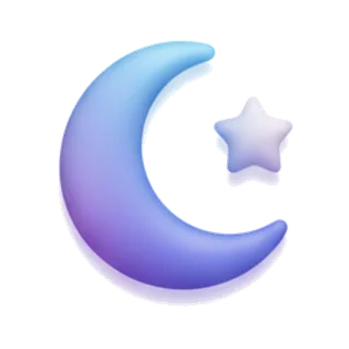
Claymorphism icons look hand-molded from soft plasticine: puffy rounded volumes, matte surfaces, pastel colors, and the signature double shadow — one outer drop, one inner highlight — that makes shapes feel squeezably thick.
When to use claymorphism icons
Clay is the friendliest 3D style, which is why edtech, kids products, wellness apps, and onboarding flows adopted it. It communicates "safe to touch" better than any flat style. Clay icons want generous size and soft-colored backgrounds; the puffiness that charms at 96px turns to blobs at 20px, so pair with a simple flat set for small UI.
Best for
- Education and kids apps
- Wellness and mental health products
- Onboarding illustrations
- Duolingo-style gamification
- Friendly empty states
Example prompts
Paste one of these into the generator, or describe your own theme — every icon in the batch comes out in the same claymorphism style.
Frequently asked questions
What is the difference between claymorphism and neumorphism?+
Neumorphism embosses shapes into the background surface — subtle, monochrome, low contrast. Claymorphism pops shapes out as thick colorful volumes with visible depth. Clay is bolder, more playful, and far more legible.
What colors work best for clay icons?+
Soft pastels with slightly deeper tones for shadowed sides — mint, peach, lilac, butter yellow. High saturation breaks the matte clay illusion. Icora's pastel color mode keeps a whole batch inside the right range.
Related styles

Popular uses for claymorphism icons
Guides with specs, workflow tips, and prompts for the jobs this style handles best.
Keep reading
Make your claymorphism icon set
Describe a theme, pick the Claymorphism preset, and get a consistent set of up to 50 icons — exported as high-resolution PNG up to 4K. Free to start, no credit card required.
Start generating — it's free