Neumorphism IconsGenerate a matching set with AI
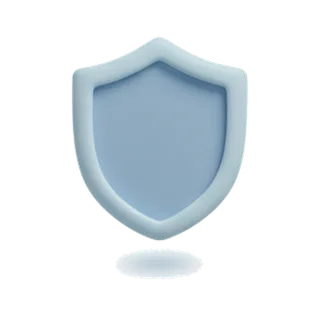
Neumorphic icons appear pressed from the surface they sit on: the same color as the background, shaped entirely by a light shadow above and a dark shadow below. No outlines, no fills — pure sculpted surface.
When to use neumorphism icons
Neumorphism suits calm, minimal products — meditation apps, smart home controls, audio interfaces — where the whole screen shares one soft material. It is a full commitment: neumorphic icons only make sense on neumorphic surfaces with matched background tones. Contrast is inherently low, so reserve it for decorative and secondary elements and keep critical actions in higher-contrast treatments.
Best for
- Meditation and sleep apps
- Smart home control panels
- Audio and music interfaces
- Minimal dashboards
- Concept and portfolio work
Example prompts
Paste one of these into the generator, or describe your own theme — every icon in the batch comes out in the same neumorphism style.
Frequently asked questions
Why do neumorphic icons need matching backgrounds?+
The illusion is that the icon and background are one continuous material. If the background hue differs from the icon body, the emboss breaks and shapes look pasted on. Generate with your interface background color specified so shadows are computed against the right tone.
Is neumorphism accessible?+
Its low contrast fails WCAG for essential controls, which is why pure neumorphic UI faded. The modern compromise: neumorphic surfaces for containers and decoration, with high-contrast glyphs or accents for anything users must find quickly.
Related styles

Keep reading
Make your neumorphism icon set
Describe a theme, pick the Neumorphism preset, and get a consistent set of up to 50 icons — exported as high-resolution PNG up to 4K. Free to start, no credit card required.
Start generating — it's free