Glassmorphism IconsGenerate a matching set with AI
Glassmorphism icons look cut from frosted glass: translucent panels, background blur, a bright 1px edge where light catches the rim, and soft internal shadows. The style became the visual signature of modern OS design languages.
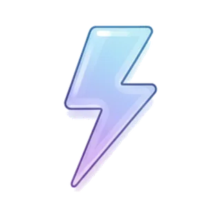
When to use glassmorphism icons
Glass icons fit dashboards, fintech, weather apps, and interfaces layered over colorful gradients or photography — the translucency needs something behind it to refract. They read premium and current, especially in dark interfaces with vivid ambient color. Give them breathing room: frosted panels stacked tightly lose the depth illusion that sells the material.
Best for
- Modern dashboard UI
- Fintech and crypto apps
- Weather and utility apps
- Gradient-heavy landing pages
- OS-style widget design
Example prompts
Paste one of these into the generator, or describe your own theme — every icon in the batch comes out in the same glassmorphism style.
Frequently asked questions
What makes glassmorphism read as glass?+
Four cues working together: partial transparency, background blur, a light catch on the top edge, and a subtle inner shadow for thickness. Remove any one and the material turns to plastic. The generated icons bake these cues into each composition.
Do glassmorphism icons work on plain white backgrounds?+
They survive but lose magic — translucency needs color behind it to prove itself. If your product is mostly white, place glass icons on gradient chips or colored cards to restore the effect.
Related styles

Keep reading
Make your glassmorphism icon set
Describe a theme, pick the Glassmorphism preset, and get a consistent set of up to 50 icons — exported as high-resolution PNG up to 4K. Free to start, no credit card required.
Start generating — it's free