Sketchy IconsGenerate a matching set with AI
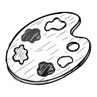
Sketchy icons look like the first confident pencil pass on tracing paper: strokes that overshoot corners, double-drawn lines, and hatching that says "work in progress" on purpose. Where hand-drawn styles are finished drawings, sketchy styles perform the act of drawing itself.
When to use sketchy icons
Sketch aesthetics signal ideas-in-motion, which makes them perfect for wireframing kits, brainstorm tools, education, workshops, and product walkthroughs that want to feel approachable rather than final. The style pairs naturally with whiteboard UIs and note-taking apps. It also lowers the stakes visually — users forgive rough edges in a product that draws itself as a sketch.
Best for
- Wireframe and prototyping kits
- Whiteboard and brainstorm tools
- Workshop and course materials
- Note-taking apps
- Explainer content
Example prompts
Paste one of these into the generator, or describe your own theme — every icon in the batch comes out in the same sketchy style.
Frequently asked questions
What is the difference between sketchy and hand-drawn icons?+
Hand-drawn icons are complete drawings with human line character; sketchy icons deliberately keep construction artifacts — overshoots, double strokes, loose hatching. Hand-drawn says "crafted"; sketchy says "still thinking". Pick sketchy when process is the message.
Do sketchy icons stay legible at UI sizes?+
The overshoots and double lines add visual noise, so sketchy sets want 20px and up. For dense toolbars, generate a cleaner companion set in the Line style and reserve sketchy icons for empty states, headers, and illustrations.
Related styles


Keep reading
Make your sketchy icon set
Describe a theme, pick the Sketchy preset, and get a consistent set of up to 50 icons — exported as clean, editable SVG. Free to start, no credit card required.
Start generating — it's free