Glossy IconsGenerate a matching set with AI
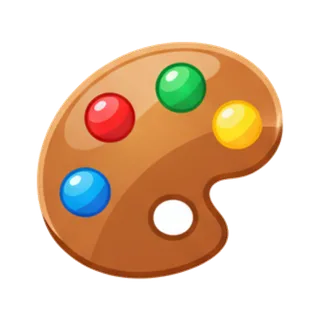
Glossy icons wear a wet-look finish: a bright specular sweep across the top, saturated candy color beneath, and enough implied curvature to make every shape feel inflated and lickable. It is the aesthetic that made early app stores sparkle, now redeployed with modern restraint.
When to use glossy icons
Gloss reads as fun, tappable, and slightly nostalgic — strong for casual games, kids products, food apps, and reward moments where a badge should feel like candy. The highlight implies a light source, so keep its angle identical across the set. Modern glossy works best selectively: glossy game buttons over a matte interface, not gloss on every surface like 2009.
Best for
- Casual game UI and buttons
- Kids apps
- Food and treat brands
- Reward and badge moments
- App icons that pop on home screens
Example prompts
Paste one of these into the generator, or describe your own theme — every icon in the batch comes out in the same glossy style.
Frequently asked questions
Is the glossy style dated?+
The 2009 everything-glossy interface is, but the finish itself never left games and food branding. The modern read is deliberate contrast: glossy accents on flat surroundings signal "this is a treat", which is exactly the job for rewards, power-ups, and kids content.
What makes gloss look convincing?+
One strong highlight following the shape's curvature, a darker saturated base tone at the bottom, and a subtle rim light. The highlight must sit at the same angle on every icon — a set lit from different directions stops feeling like a set.
Related styles




Popular uses for glossy icons
Guides with specs, workflow tips, and prompts for the jobs this style handles best.
Keep reading
Make your glossy icon set
Describe a theme, pick the Glossy preset, and get a consistent set of up to 50 icons — exported as high-resolution PNG up to 4K. Free to start, no credit card required.
Start generating — it's free